How to Design and Hang a Balanced Gallery Wall Like a Pro
Bad gallery walls rarely happen because of the art prints. Trouble starts when frames drift across bare drywall without an anchor. Eyes catch spatial friction immediately – the wall looks off instead of sharp. Design writers at Architectural Digest track this look across modern homes – messy picture clusters are turning into clean, tight grids.

Our editorial team covers wellness, productivity, and modern living \u2014 backed by research, shaped by real experience. We believe good advice should read like a conversation, not a textbook.
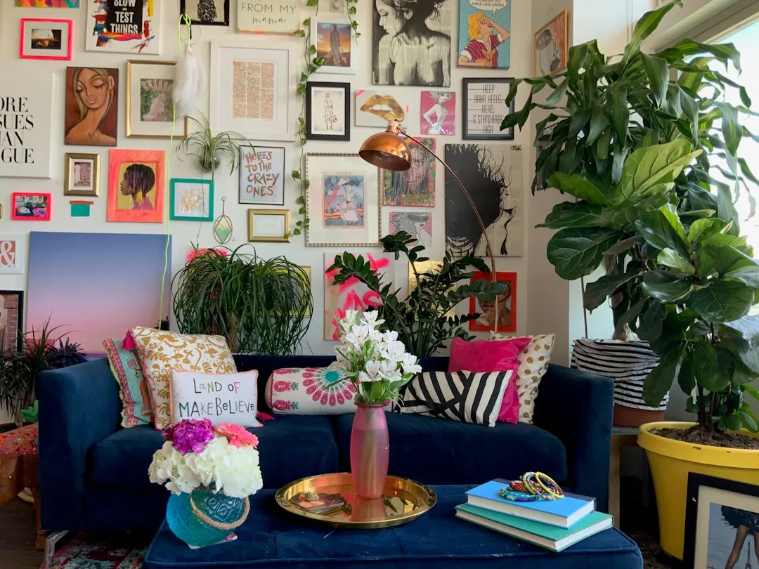
Early apartment projects teach hard lessons. Nails go straight into fresh plaster – 20 holes later, the living room wall resembles Swiss cheese. Crooked frames tilt sideways. Homeowners waste whole afternoons adjusting picture wires – the wall stays lopsided. Price tags do not fix this. Pricey oil paintings look just as bad without proper negative space.
Learning how to group frames makes all the difference. Anyone can style your wall decor cleanly without patching holes every weekend. TV designer Nate Berkus tells students that good walls look collected over time – not rushed together in 2 hours. Smart interior styling guides help nail down frame spacing, art scale, and room layouts right away.
Grounding Your Layout Above Anchor Furniture
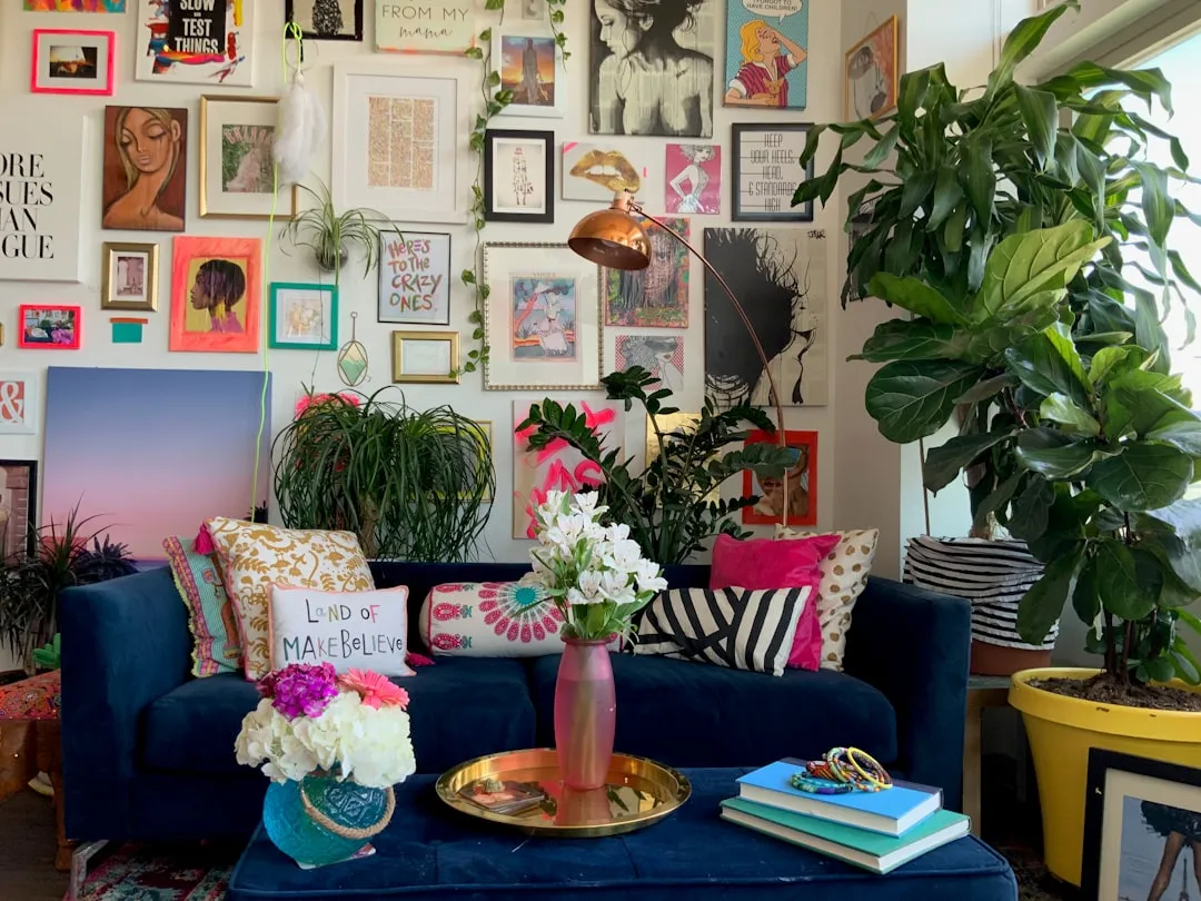
Artwork without an anchor makes zero sense. Frames left floating in midair confuse the room. Brains look for solid reference points – without one, the eye keeps searching. Forum members on Reddit r/InteriorDesign point out that floating setups leave living rooms looking top-heavy. Unfinished rooms feel uneasy. That matters.
Fixing the setup takes basic planning. Solid credenzas give scattered frames a clean baseline. Real townhouses show the difference – hanging art over a low sideboard pulls everything into place. Good living room layout ideas rely on anchor furniture to steady the room.
Edges need strict limits. Groupings placed over an IKEA MALM 3-drawer chest ($119.00) must stay inside that outer edge. A wider sideboard like the Mercury Row Anniston Buffet ($249.99) from Wayfair handles larger runs. Frames that stick out past furniture edges look goofy. Bad proportions kill the vibe. Total art width works best when filling roughly 2/3 to 3/4 of the furniture width below.
Weight Distribution and Boundary Rules
Picture walls follow visual gravity. Floating art looks messy.
Heavy items belong low. Dark wood frames and thick mats anchor the bottom – lightweight line art drifts toward the ceiling to protect visual balance.
- Limit outer art edges to match small units – like the 30 1/8 inch width on an IKEA KALLAX 2×2 shelf ($49.99).
- Leave 6 to 10 inches between the tabletop and bottom frames.
- Anchor bottom rows with dark prints – save thin line sketches for higher spots.
- Line up top or bottom frame edges along flat runs – straight lines keep things from tilting.
Wandering frames create clutter. Clean borders make decor feel planned. Baselines bring order. Walls settle down nicely.
Locking Down Precise Spacing Without Wall Damage
Artwork rarely ruins a gallery wall – bad spacing does the damage. Tight clusters end up messy when gaps wander between 1 inch and 4 inches across the same layout. Eyes register uneven gaps instantly.
Brown kraft paper solves the spacing headache. Rolls cost about $12 at hardware stores. Frame outlines get traced directly onto paper sheets with a pencil. Scissors cut out each shape. Blue painter tape sticks paper mockups right to the plaster – zero wall marks left behind.
Paper shapes shift around easily until spacing feels right. Most decorators keep gaps between 2 and 3 inches. Tight gaps lock everything together – wide gaps make art feel disconnected.
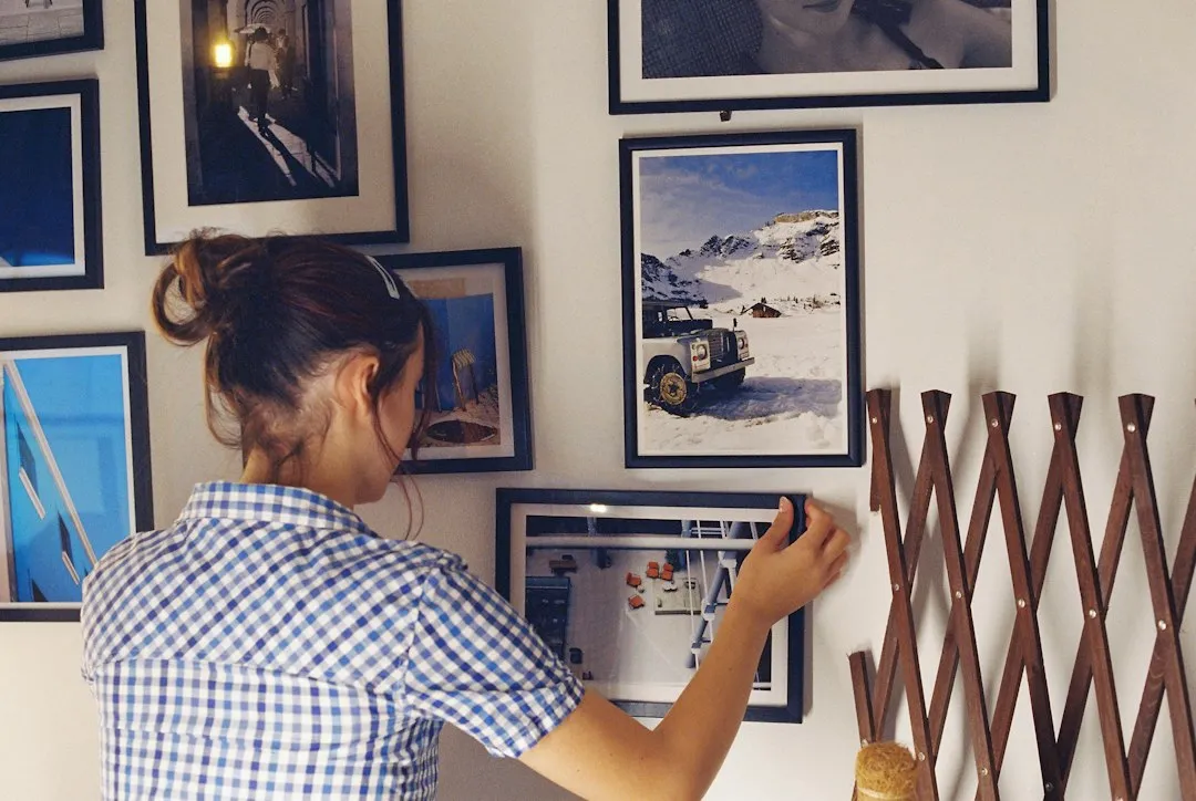
Nail placement gets marked directly on the paper templates. Hooks drive straight through the paper guides into drywall. Tearing the paper away leaves nails sitting at exact heights. Clean holes. Level pictures. The entire wall hangs straight in under 45 minutes – no patched drywall required. Simple methods work best.